
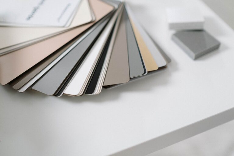

Creating a calm and inviting atmosphere in your home often begins with the colors you choose for your walls, furniture, and décor. Calm colors can reduce stress, improve mood, and make any space feel more welcoming. Whether you’re refreshing a single room or planning a full home makeover, understanding how to select and use calm colors effectively can transform your living space.
In this post, we’ll explore practical tips to help you choose calm colors that suit your style and create a peaceful environment.
Why Choose Calm Colors?
Calm colors are often soft, muted shades that evoke a sense of relaxation. These colors can help reduce anxiety and make your home feel like a sanctuary after a busy day. They also tend to blend well with various design styles, from modern minimalism to cozy traditional homes.
Common calm colors include soft blues, gentle greens, warm neutrals, and light greys. However, the best calm color for your home depends on your personal preference, the natural light in your space, and the mood you want to set.
Tips for Choosing Calm Colors
1. Consider the Room’s Purpose
Each room has a different function, and the colors you choose should reflect that:
– Bedrooms: Opt for soft blues, lavender, or pale greens to promote restful sleep.
– Living Rooms: Warm neutrals like beige or soft grey create a welcoming and relaxed environment.
– Bathrooms: Light blues or seafoam greens can give a fresh, spa-like feel.
– Home Offices: Muted blues or gentle greens help maintain focus without feeling stark or sterile.
2. Start with a Neutral Base
Neutrals are the foundation of calm color palettes. Shades like off-white, cream, taupe, or light grey create a soothing backdrop that allows other colors and décor to shine. Neutrals can also make rooms feel more spacious and airy.
If you’re unsure where to start, painting walls in a neutral shade gives you flexibility for adding colorful accents through pillows, rugs, or artwork.
3. Use Nature as Inspiration
Nature offers some of the most calming color combinations. Think of the colors found in:
– A clear blue sky
– Ocean waves
– Forest greenery
– Sandy beaches
Drawing inspiration from these elements can help you find colors that feel balanced and familiar. For example, pairing a soft sage green with sandy beige mimics the calmness of a forest floor.
4. Test Colors in Your Space
Lighting plays a huge role in how colors appear. A shade that feels calm at the paint store can look different once applied to your walls.
Before committing to a color:
– Paint a small test patch on your wall.
– Observe it at different times of the day, noting how it changes with natural and artificial light.
– See how it pairs with your furniture and décor.
This experimentation helps ensure the color truly feels calming in your specific environment.
5. Opt for Matte or Satin Finishes
Glossy or high-shine paint finishes can reflect a lot of light and create a more energetic vibe. For calm spaces, matte or satin finishes are better because they absorb light softly and offer a more subdued look.
6. Limit Bright and Bold Accents
While accents can add personality, too many bright or bold colors can disrupt the calm feel. Choose accent colors sparingly and look for muted versions of your favorite bright shades if you want to add interest without overwhelming the space.
7. Mix Warm and Cool Tones Thoughtfully
Both warm and cool colors can be calming, but mixing them thoughtfully is key.
– Warm tones like soft taupe or peach add coziness without overpowering.
– Cool tones like pale blue or green bring in freshness and tranquility.
Combining these tones in complementary ways can create a balanced and inviting room.
8. Incorporate Textures Alongside Color
Color alone does not create calm. Pair your chosen colors with soft textures such as cozy blankets, plush rugs, and natural wood elements. Textures add depth and warmth, reinforcing the calming atmosphere.
Popular Calm Color Palettes to Consider
Here are a few tried-and-true color combinations to inspire your next project:
– Soft Blue + Light Grey + White: Classic and timeless, this palette feels fresh and peaceful.
– Sage Green + Beige + Cream: Earthy and warm, perfect for creating a grounded and natural environment.
– Pale Lavender + Soft Pink + Off-White: Subtle and romantic, great for bedrooms or reading nooks.
– Warm Taupe + Dusty Rose + Ivory: Elegant and inviting, ideal for living and dining areas.
Final Thoughts
Choosing calm colors for your home can have a wonderful impact on your everyday life. By considering the purpose of each room, testing colors in your space, and using nature-inspired palettes, you can create environments that promote relaxation and comfort. Remember to complement your color choices with soft textures and finishes that encourage calmness.
With these tips, you’re well on your way to designing a peaceful home where you can unwind and recharge.
Happy decorating!